What is a Cumulative Flow Diagram?

A Cumulative Flow Diagram is a visual metric used in Kanban to analyze the stability of the workflow. Though there are many ways to draw data from a Kanban solution, the CFD, sometimes referred to as the burn-up chart, is the best way to track progress and estimate process health quickly and effortlessly.
Who needs a CFD?
How many times have you been called to your supervisor’s office to give an update on their favorite project? You’ve explained that the data wasn’t on hand, and if given a few hours, you may be able to provide an answer. You can save those few hours and use a Cumulative Flow Diagram for just that - it will answer the question for you in an objective and all-inclusive way, as it accumulates all the project tasks and clearly shows tendencies for their completion. Send the CFD directly to your boss, or have it available online for the management, team, and stakeholders to pull information from for themselves, at any time.
Did you know?
The Kanban Tool® web service builds Cumulative Flow Diagrams automatically, as you process tasks on your digital Kanban board. Take advantage of performance insights without any extra work - try the service now for free!
A CFD layout
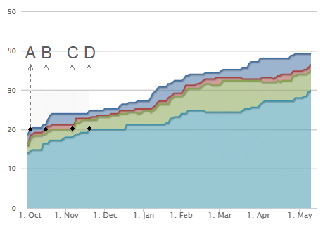
The diagram shows data in an area graph, displaying the total volume of work for any of the process stages. If you have four columns: to do, in progress, in review, and done, then your CFD will have four areas. The x-axis represents the elapsed time, while the y-axis holds the number of work items.
Jumps and flat lines on the Cumulative Flow Diagram instantly show you where any bottlenecks or lack of activity are present. Meanwhile, smoothly rising lines stand for continuous progress, ensuring an accurate prediction of the project’s completion date.
Example A software development company may have the following work stages:
- Customer ready request (blue),
- Requirements set (red),
- Development and testing complete (green),
- Request delivered to the customer (turquoise).
This means the company will have 4 areas to their Cumulative Flow graph, one area per each of the stages:

We can see that in October, there were 20 customer requests (blue area - letter A). Between October and November, the team worked on twenty requirements specifications (red area - letter B). Around the end of November, nearly twenty items have been completed in the requirements specification phase, and twenty tasks were in review (green area - letter C). And at the beginning of December, the team had twenty items completed (turquoise area - letter D). So, their total Cycle Time for twenty work items is about two months.
Use a Cumulative Flow Diagram to predict the future
You could look at the smoothness of the lines to determine the predictability or efficacy of a process step. Team members could see that around February, there was a spike in customer demand, shortly leading to the green area increasing in velocity over the other process stages. A clear signal, that unless more developers are employed, the cycle time is going to increase significantly. Understanding the processes that a team is a part of helps them to better respond to changing conditions.
But the best way to use a CFD is to predict when an item will get completed. One of the most important reasons for the success of any business is the alignment of their estimates with reality. Using data from the Cumulative Flow Diagram, you can determine when items will get completed, and the longer the time that data was gathered over, the more reliable your predictions. Imagine being able to estimate project completion using several months of data accumulated automatically by Kanban software your chances of success increase significantly, with hardly any analytical work needed on your part!
