Analytics

Uncover the invaluable workflow metrics in Kanban Tool! Wondering how to spot process issues? The automatically-generated graphs make it easy to track your team’s performance, quickly identify any bottlenecks, and use these insights to drive impactful improvements.
Your board's metrics are available under Settings - Analytics.

How to access Kanban Tool Analytics?

To easily track progress of your teamwork, use Kanban Tool’s automatically generated Analytics!
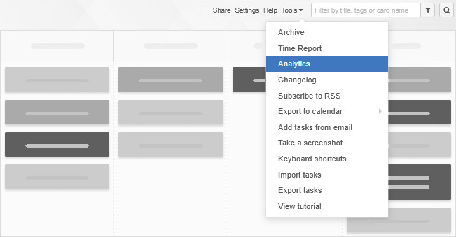
Just head to the Tools menu in the top right corner of your board, and select Analytics.

How to access Analytics?

Inside the Analytics section you will find a Breakdown chart, a Lead & Cycle Time diagram, and a Cumulative Flow chart. Here you can learn more about what each graph is helpful with.

If you’re on the Enterprise service plan, you’ll also have access to the Time Report under Tools for even deeper process insights.

Watch the video to learn more about how Kanban Tool’s Analytics can help you measure and optimize your workflow:

What are Kanban Tool’s reporting capabilities?

Cumulative Flow Diagram

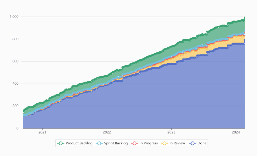
The Cumulative Flow Diagram gives you a clear, big-picture view of your process by showing how work items are distributed across all of your board’s work stages.

It allows you to assess how smoothly your team is working. If everything is flowing well, the horizontal bands—each representing tasks in a different column—stay steady, with only the Done work section steadily growing.
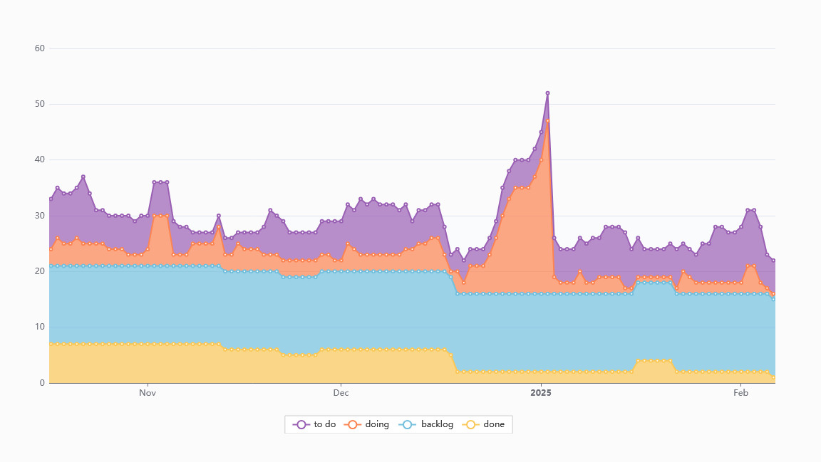
If the In Progress band starts to rise sharply, it’s a red flag. It could mean tasks are piling up, team members are overloaded, or something is slowing progress. This visual cue helps you act fast—whether it’s adjusting workload, adding resources, or providing more clarity.

The CFD is one of the most insightful metrics available—giving you a real-time view of team performance, no office visit needed!

To read a bit more about Cumulative Flow Diagrams, please turn here, and to learn more about the diagram’s use inside Kanban Tool, please visit this page.

Lead & Cycle Time Diagram

Want to know how long tasks actually take to get done? The Lead & Cycle Time Diagram tracks the time tasks spend between specific work stages, informing you where in the process the bulk of time is being spent, in other words, helping you measure process efficiency.

For most businesses, keeping Lead Time short is critical—it means faster responses to customer needs and a more agile workflow.

Find out more about a process’ lead time and cycle time. To see how to use Kanban Tool’s Lead & Cycle Time graph, visit this page.

Breakdown Chart

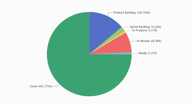
These simple yet powerful pie charts break down your process into meaningful insights. You can analyze your task distribution by:

  • Columns
  • Card types
  • User assignments
  • Priority levels
  • Task difficulty
  • Tags
  • Custom fields

This breakdown can be applied to the entire board or zoomed in on specific columns or swimlanes only, helping you fine-tune the analysis.

You can learn more about the use of Kanban Tool’s Breakdown Charts here.

Time Reporting

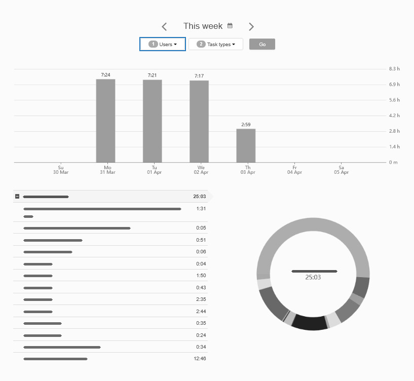
The Time Report gives you an intricate view of how time is spent—whether for individual team members or the entire team. It shows exactly how much time was dedicated to each task across all your Kanban boards, providing both summary and detailed views.

Note: The time tracking & reporting feature is available exclusively on the Enterprise service plan.
You can learn more about time tracking here, and get a closer view at time reporting here.

Process Automation

You can further boost your workflow analysis with custom email reports and alerts. For example, process automation allows you to set up notifications for:

  • Tasks running longer than expected
  • Time estimates exceeding set limits
  • Tasks that haven’t been updated in a while
  • Upcoming due dates for specific task types
  • …and much more!

Note: Process automation is available exclusively on the Enterprise service plan.
Read more about how the feature works here.

Work Summaries & Reminders for Proactive Reporting

To stay on top of things, you can also enable the Work Summary email to receive a recap of what you and your team accomplished each day. Plus, set up due date reminders to get a heads-up on the day’s most important tasks—so nothing slips through the cracks.
How to use the Breakdown Chart?

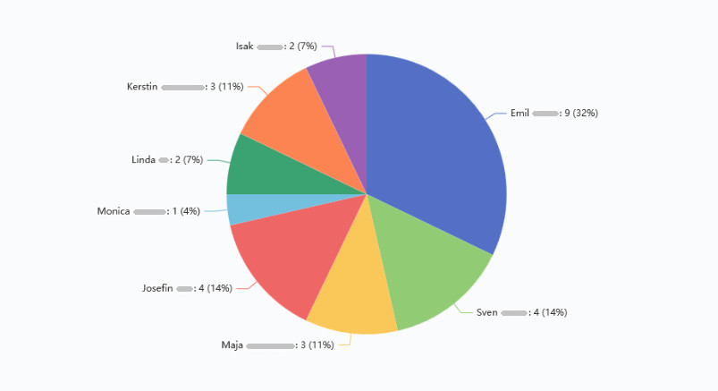
The Breakdown Chart helps you visualize key data from your board, making it easier to analyze task distribution, team workload, priorities, and more.

Use it to gain insights into:

  • Task distribution among team members
  • Task types and their share within the workflow
  • Priorities and workload balance
  • Assignments and individual contributions
  • Size ratios of different work categories

You can analyze data for the entire board or focus on specific swimlanes, columns, column types or task types (colors) to drill down into key details.

It’s a simple yet powerful way to spot trends and optimize your workflow!

A Breakdown Chart example

What are Time Reports?

The Time Report is a key metric tied to the time tracking feature, giving you valuable insights based on the hours your team logs while working on tasks.

You can use the Time Report to:

  • Track task efficiency – See how fast different types of tasks get completed.
    How? → Filter the report by task type.
  • Analyze team workload – Understand how much time each team member spends on specific tasks.
    How? → Filter the report by user.
  • Identify process bottlenecks – Find out which stage of the workflow takes the longest.
    How? → Group the report by stage.

Find out more about using the Time Report in this guide.

Note: Time tracking and reporting are available exclusively on the Enterprise service plan.

Time report - summary

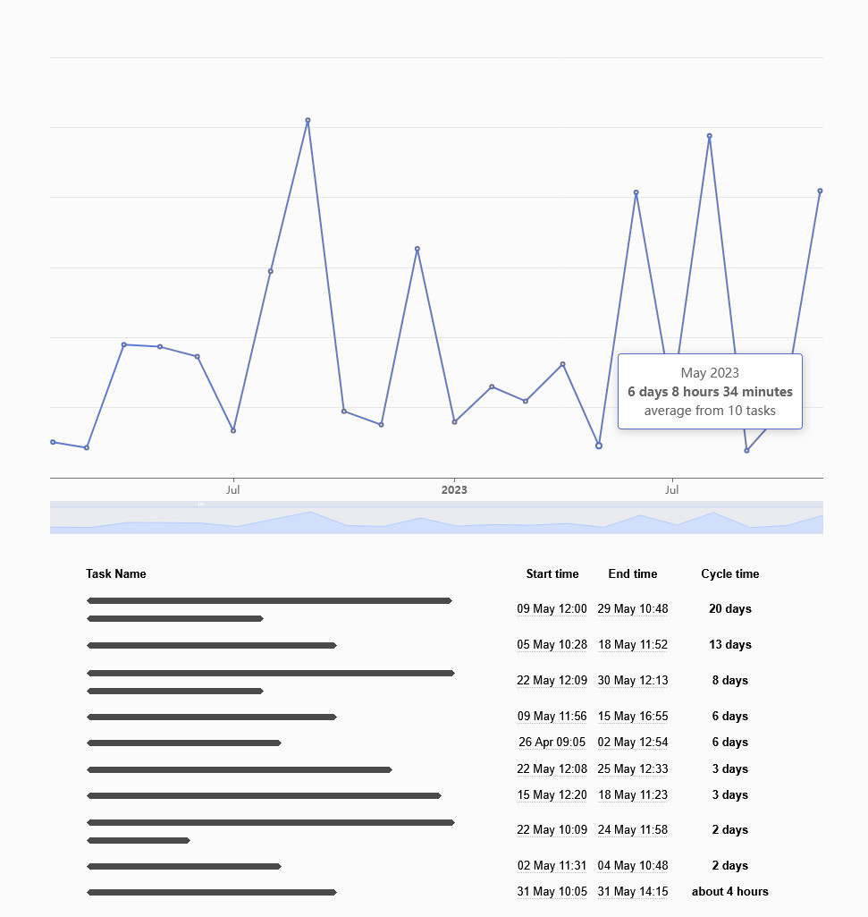
What is the Lead & Cycle Time Diagram for?

The Lead & Cycle Time Diagram in Kanban Tool helps you measure the average cycle time of tasks, providing valuable insights into your workflow efficiency.

How does it work?

Start by selecting your desired parameters in the diagram’s dropdown options:

Show how long it takesselectedtaskswith selected parametersto get fromselected column/swimlanetoanother selected columnina set time.

Once you’ve set your parameters, the system generates a graph. You can click on the blue points to view details about specific tasks completed during that period.

A Lead and Cycle Time diagram example

Lead time vs. cycle time

  • Lead time → The total time from a task’s creation to its completion.
  • Cycle time → The actual time spent actively working on a task.

By adjusting the from and to columns, you can see either:

  • The full journey of tasks — e.g., from BacklogDone — so, the lead time
  • The time spent actively working — e.g., from DoingDone — so, the cycle time

A comparison like this helps you understand team efficiency and process throughput, making it easier to identify bottlenecks and improve workflow speed.

Curious to learn more?

What does the Cumulative Flow Diagram tell me?

The Cumulative Flow Diagram (CFD) visualizes the buildup of tasks on your board over time, helping you track workflow stability and identify bottlenecks.

How to read the CFD?

  • Horizontal axis → Time progression
  • Vertical axis → Number of tasks in different workflow stages
  • Color bands → Each stage of your process, e.g. To Do, In Progress, Done,

The bottom band — typically representing completed tasks — should steadily rise as work gets done. This is why CFDs typically take the shape of a rising slope.

A Cumulative Flow Diagram example

Key insights from CFD:

  • Smooth, even bands → A steady workflow with tasks being completed at a constant pace.
  • Jumps, dips, or uneven In Progress bands → Work is getting stuck, tasks are piling up, or bottlenecks are forming.
    CFD - example of an uneven workflow
  • Expanding To Do bands, steady In Progress bands → The backlog is growing while work capacity remains unchanged, possibly signaling the need for more resources.

Customizing your diagram view

You can toggle the workflow stages on/off by clicking the labels at the bottom of the graph to focus on specific process steps.

Curious to learn more?

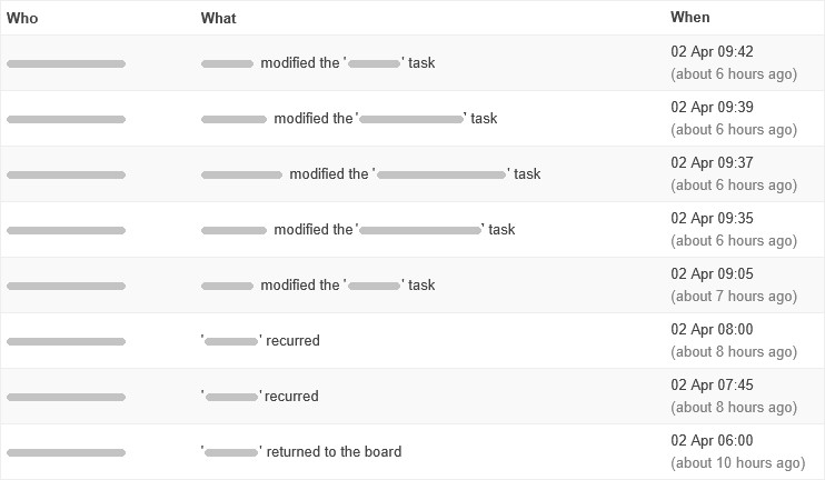
What can I learn from the Changelog?

The Changelog, available under the board’s Tools menu, provides a detailed record of all changes made on the board, helping you track modifications and stay informed about team activity.

What can you track?

  • Who made changes and when
  • What was modified (tasks, due dates, comments, etc.)

Using changelog filters, you can narrow down the results by time frame, user, or type of change.
You can choose to view:

  • All recorded changes
  • Task movements only
  • Comment additions only
  • Task modifications alone

Need to know who suddenly shortened all your due dates? The Changelog has you covered!

Changelog records example

Time estimates: How to manage your team's working time?

Want to keep your team focused and working efficiently? A great way to ensure tasks are completed within a given time is by using the Estimated Time field and setting Work in Progress (WIP) limits based on those estimates.

Estimating time for tasks

To help manage workload, there’s a WIP limit setting controlling how many tasks can be in the In Progress column type—based on the sum of their estimated working time.

For example, if your team works an 8-hour day, and each task has an Estimated Time set, you can apply this setting to ensure your team only starts as many tasks as they can realistically complete in that time.

How to set it up?

This helps prevent overload, keeps workflows smooth, and ensures tasks get completed on time.

You can learn more about the benefits of using the Estimated Time field here.

Is there a way to reset analytics tracking?

No, analytics tracking cannot be reset.
You can, however, focus on a specific time period by adjusting the metrics settings to view only the data you’re interested in.

If you’re looking for a fresh start with no analytics history, consider cloning your board. When you create a clone, you can copy all active (non-archived) tasks, but task history—including comments, assignments, and analytics—won’t carry over. This gives you a clean slate while keeping your current tasks intact.

How to track one's own productivity?

While built in mind with teamwork tracking, Kanban Tool also offers several ways to track individual productivity, so you can stay on top of your work and improve efficiency.

Quick & simple — check the “Done” column

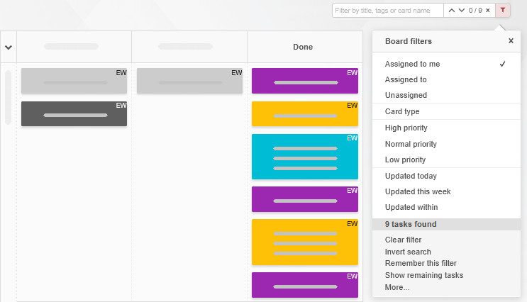
The easiest way to track your progress is by reviewing the Done column. To see only your tasks, simply filter the board by assignment.

View done tasks assigned to yourself

Use built-in Analytics for deeper insights

For a more structured approach, leverage the automatically generated metrics facilitating per-user filtering:

  • Breakdown chart – Shows workload per person and/or task/column type.
    Breakdown of assignments
  • Time report – Tracks the amount of time spent on tasks per team member.
    Time report sorted by individual user

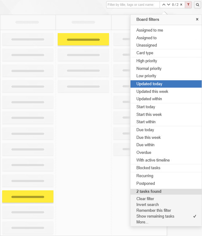
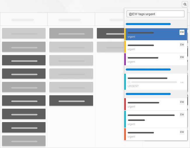
Use global search to find tasks based on any parameter. You can also utilize process automation to create custom reports and auto-send them to specific users.

Search results by assignment and tags

Tracking own tasks with My work

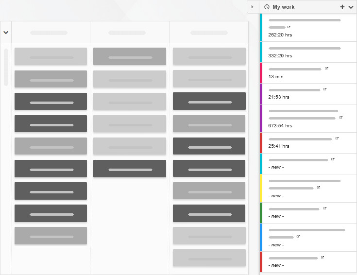
The My work widget is made for individual productivity tracking, gathering all tasks assigned to you across boards, allowing you to sort, activate, time, and manage them in one place.

My work view of ones tasks across several boards

Stay on track from anywhere

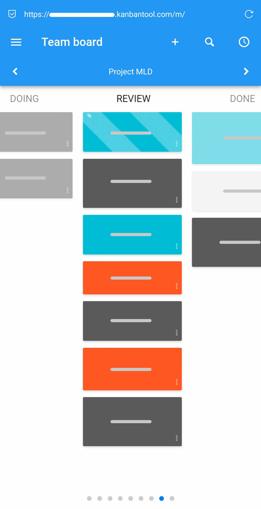
Need to update your progress on the go? The Kanban Tool mobile app lets you review and manage tasks from your smartphone — anytime, anywhere.

Mobile access to Kanban Tool