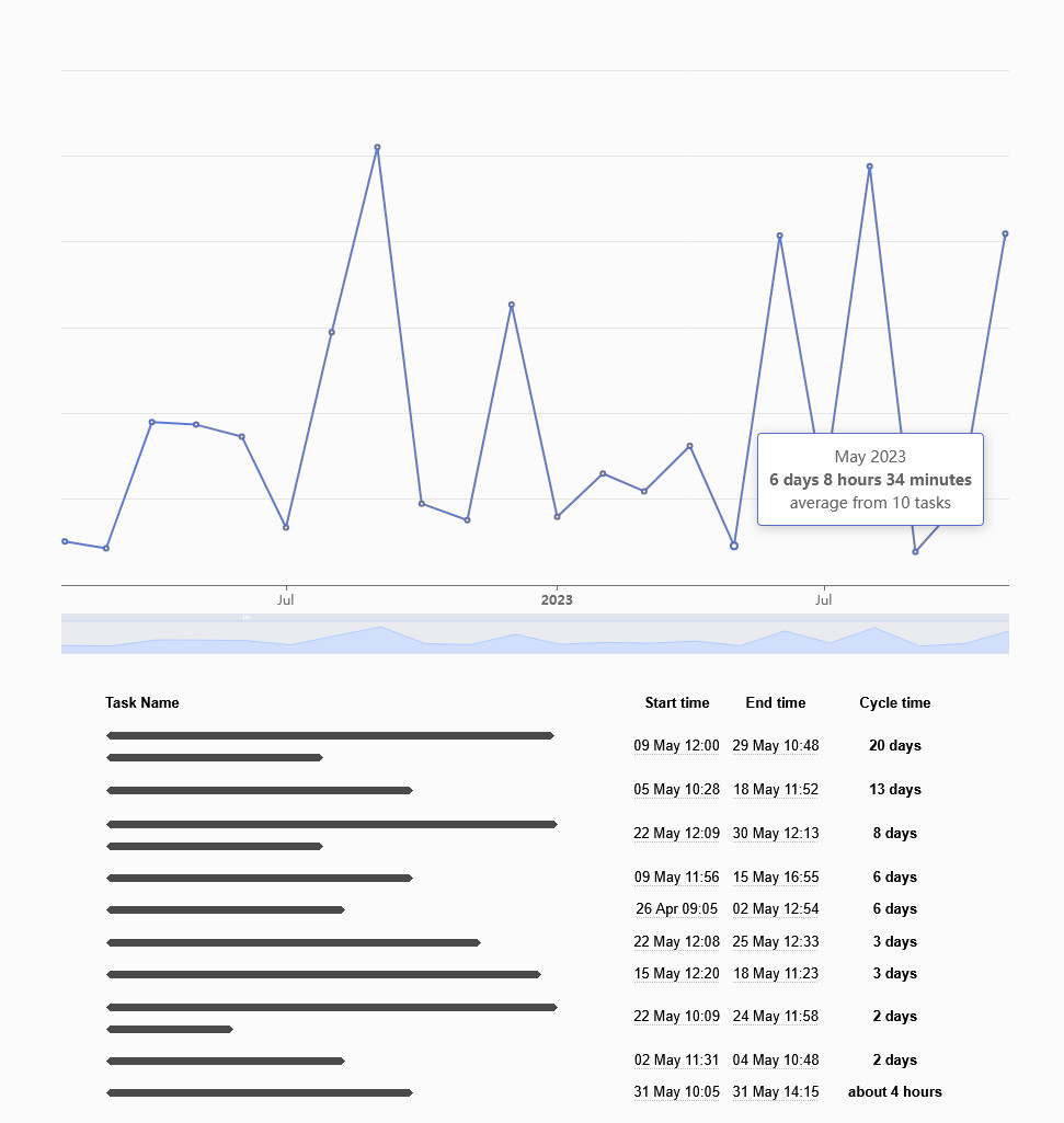
What is the Lead & Cycle Time Diagram for?
The Lead & Cycle Time Diagram in Kanban Tool helps you measure the average cycle time of tasks, providing valuable insights into your workflow efficiency.
How does it work?
Start by selecting your desired parameters in the diagram’s dropdown options:
Once you’ve set your parameters, the system generates a graph. You can click on the blue points to view details about specific tasks completed during that period.

Lead time vs. cycle time
- Lead time → The total time from a task’s creation to its completion.
- Cycle time → The actual time spent actively working on a task.
By adjusting the from and to columns, you can see either:
- The full journey of tasks, e.g., from Backlog → Done, so, the lead time.
- The time spent actively working, e.g., from Doing → Done, so, the cycle time.
A comparison like this helps you understand team efficiency and process throughput, making it easier to identify bottlenecks and improve workflow speed.