What does the Cumulative Flow Diagram tell me?
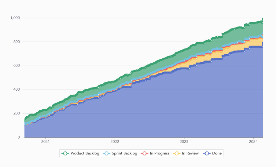
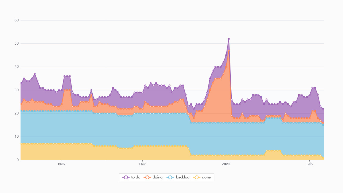
The Cumulative Flow Diagram (CFD) visualizes the buildup of tasks on your board over time, helping you track workflow stability and identify bottlenecks.
How to read the CFD?
- Horizontal axis → Time progression
- Vertical axis → Number of tasks in different workflow stages
- Color bands → Each stage of your process, e.g. To Do, In Progress, Done
The bottom band, typically representing completed tasks, should steadily rise as work gets done. That’s why a healthy process’ CFD is usually shaped as a rising slope.

Key insights from CFD:
- Smooth, even bands → A steady workflow with tasks being completed at a constant pace.
- Jumps, dips, or uneven In Progress bands → Work is getting stuck, tasks are piling up, or bottlenecks are forming.

- Expanding To Do bands, steady In Progress bands → The backlog is growing while work capacity remains unchanged, possibly signaling the need for more resources.
Customizing your diagram view
You can toggle the workflow stages on/off by clicking the labels at the bottom of the graph to focus on specific process steps.