If you aim to enhance your team project success, you require a collaborative project management system that is easy to understand and use and capable of monitoring progress and performance.
Kanban, a process management method that has been revolutionizing workflow and resource management over the last two decades, enhancing the efficiency of projects throughout their entire lifecycle, serves as an ideal solution.
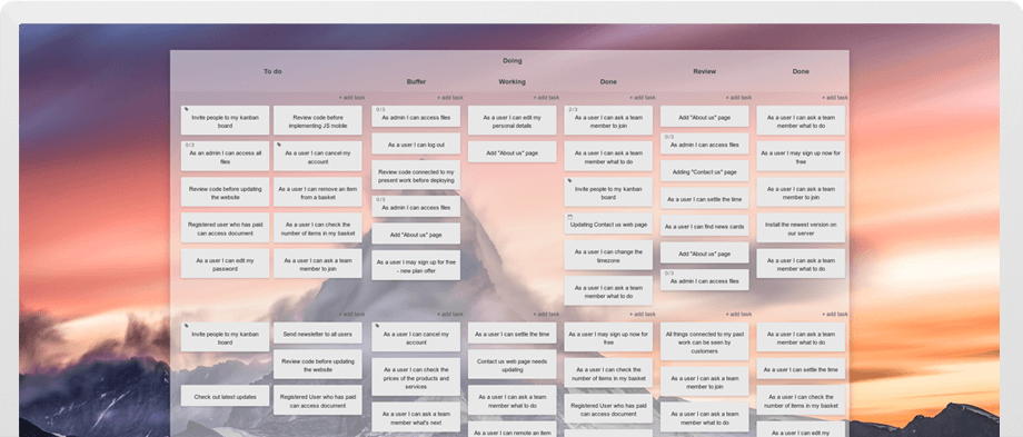
Kanban achieves this by enforcing workflow visualization on Kanban boards, where each work item represents a task in a column reflecting its current completion state. Work in Progress (WIP) limits are utilized to restrict the number of tasks processed at specific stages. The transparency gained through a Kanban board accessible to the team, coupled with improved completion rates attributed to WIP limits, makes the Kanban method a winner for teams seeking an effective yet straightforward task management system.
But there's more to it.
What are Kanban metrics?
The design of a Kanban board enables easy tracking and reporting on process health, issues, and measurement of your team's performance. The most characteristic Kanban metrics are cumulative flow, lead & cycle time, breakdown charts and process throughout. Additionally, Kanban teams can use their boards to monitor process bottenecks, queue sizes, team distribution and performance, or total working time.
While a traditional, physical Kanban whiteboard necessitates manual calculation and data-keeping for analysis, online Kanban boards automate this process, tracking task history effortlessly. Setting up your process's unique columns on the Kanban board initiates seamless statistical information collection, emphasizing that richer data on cards and boards enables more insightful analysis.
Cumulative flow

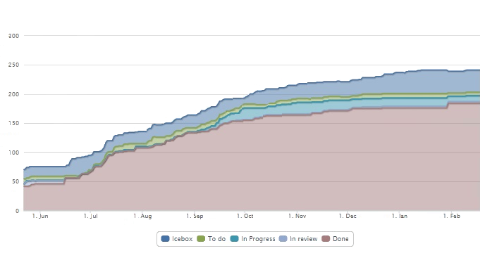
The Kanban method emphasizes focus on incremental improvemnts over time, and the cumulative flow is key to assessing those improvements. The metric presents an aggregated overview of all process tasks: the waiting, the currently progressed and the done ones, highlighting their distribution across these phases in horizontal bands. Each color stands for the volume of tasks in a given stage at a given time. It serves as a real-time performance indicator, allowing instant identification of issues such as tasks overload: the in progress band increasing in height, process constraint: a sudden narrowing of any band, or of extra team bandwidth: the in progress band slimms down.
Lead & cycle time
The information offered by the lead & cycle time diagram allows your team to accurately estimate how quickly they can deliver a product to the client. That makes it an analysis key to building and maintaining successful long-term customer relationships.
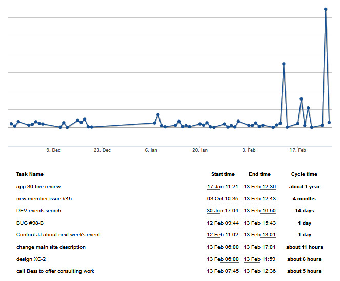
The lead time is the number of days between a client request's placement on the board and that request delivery to them. From your clients' point of view, it's the measurement of your team's speed. The actual time your team actively works on the request - i.e., the time they have this task in their in progress column, without the backlog/waiting stages - that is the cycle time.

Relating the cycle time to the lead time gives you a core understanding of the heft and lag within the process or its agility.
The fastest way to shorten the lead and cyle times is through thoughtful WIP limitations. The fewer items in the active working stages, the quicker they should move to the done lane. And the faster the flow of tasks through all columns and the smaller the wait between the moves, the shorter the lead time. The lead & cycle time information is crucial for assessing the process throughput and emphasizes the importance of minimizing the lead time for prompt responses to customer needs.
Breakdown charts
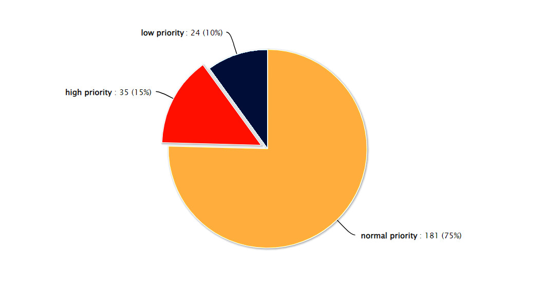
They are simple visual representation of the task count, difficulty, priority, type or assignments distribution on the board, allowing for a quick analysis of the current process makeup and any unevenness within. Breakdown charts also afford a focused examination of items within specific process steps or swimlanes - rows of the board - drawing attention to bottlenecks about to form or insufficient resource allocation in given areas.

Further Kanban analytics
Relying to the three metrics above gives you informative and actionable insight into the process performance and can highlight problem areas.
However, you can glean additional information about the process state form the following analysis.
Throughput
Throughput refers to the number of tasks a team can complete within a specified timeframe and can serve as indicator of process health, when measured regularly. The metric is particularly valuable in processes where all items have a similar difficulty level. Because the Kanban method is often employed in knowledge-based process management, where task complexity varies, throughput tends not to be emphasized by Kanban teams. Nevertheless, if your team deals with tasks of diverse difficulty or size, measuring throughput for a set difficulty or size and comparing individual values over time can be highly beneficial. This practice allows for assessing the general level of speed consistency in handling tasks of different complexities.
Bottleneck tracking
Identifying process bottlenecks is straightforward on the Kanban board itself – you'll notice an increase in the number of tasks at a specific process step. If not resolved in time, the blockage will inevitably affect preceding steps. The cumulative flow, lead, and cycle time metrics further facilitate the identification of bottlenecks.
However, it's crucial for the team to sustain a flowing process for as long as possible. Avoid working around a persistent bottleneck by leaving problematic tasks idling in the Work in Progress (WIP) column, while the team takes on new tasks. Tolerating this practice is a recipe for costly delays, a decline in reputation, and profit loss. Instead, implement a policy of assigning problematic items to a team expert or escalating the issue internally when a solution cannot be found using the regular process. This proactive approach ensures that bottlenecks are not merely circumvented but are effectively addressed, contributing to the overall efficiency and success of the project.
Queues: The cost of waiting
As mentioned earlier, the stages where work awaits the team's attention are not considered in the cycle time but remain a significant factor in lead time—the team's perceived speed by clients. While it's challenging to completely eliminate waiting stages, it's evident that reducing them directly enhances lead time, productivity, and the team's responsiveness to changing requirements.
Addressing this issue involves implementing a Work in Progress (WIP) limit for waiting stages. It promotes the idea that if a waiting stage reaches its limit, the team responsible should redirect their focus further down the process. This redirection enables a quicker resolution of subsequent process steps. A proactive approach, such as swarming to resolve bottlenecks and restart the flow of work, proves effective in maintaining a smooth workflow and reducing the cost associated with items awaiting processing. By minimizing waiting times, teams can optimize productivity and enhance their ability to adapt swiftly to evolving project demands.
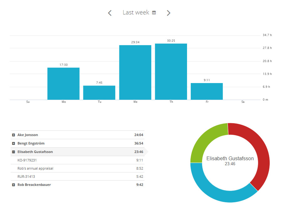
Time report
A time report provides a detailed account of work time entries for each team member, offering visibility into time allocation for every task, project, stage, swimlane, etc. Regardless of your ability to track process throughput and the lead time, a time report delivers additional insight into the performance of individual team members and the timeframes of given projects.

Why your business
needs Kanban metrics?
Kanban metrics offer more than statistical data; they indicate your project's efficiency, guiding informed decision-making on team allocation and deadline planning. Early detection of impediments enables swift reassignment of resources, enhancing overall efficiency and avoiding delayed deliveries and escalated costs.
Accurate forecasting in project management is crucial for resource allocation, client management, and timely deliveries. Metrics like lead and cycle times help estimate task completion and establish realistic deadlines, while real-time throughput monitoring provides insights for necessary forecast adjustments.
Incorporating Kanban metrics into daily management goes beyond addressing immediate issues; it involves iterative refinement for future projects - one of the key elements of the Kanban method. Such proactive approach enables continuous improvement, adaptation, and higher value delivery in a shorter time.

How to implement Kanban Metrics?
To seamlessly integrate Kanban tracking and analysis into your project management, consider leveraging dedicated software like Kanban Tool. Recognized as an established agile project management platform, Kanban Tool combines ease of use and automated tracking with extensive customization options.
Kanban Tool boards offer comprehensive metrics, insights, and reporting features aligned with effective agile management methodologies. Kanban Tool analytics ensure progress visibility, helping to keep teams aligned and projects on the right track. For those just starting out, the included board templates and an AI assistant for board creation simplify the initial setup process.
Elevate project performance
with Kanban Tool metrics
Kanban Tool consolidates essential performance metrics, streamlining the reporting process and enabling a seamless experience that eases and informs your workload.
What sets Kanban Tool apart from its competitors is its remarkable adaptability to meet the unique needs of any team. Whether you're striving for excellence in your projects, aiming to optimize flow, streamline processes, or make them more efficient and impactful, Kanban Tool emerges as the optimal solution.
Besides the automatically generated process metrics, Kanban Tool offers unlimited boards with swimlanes support, card templates with custom fields, process automation, seamless time tracking, and over 30 helpful add-ons. Additionally, an option to host it on your company server ensures ultimate data control.
If eliminating manual performance tracking entices you, consider starting a free trial now to experience next-level Kanban project management with automatic metrics!
